
Color Consistency in Mobile Photography: Matching Multi-Device Shoots
Mobile photography has reached a level where clients, teams, and creators expect “camera-ready” results from phones. Yet one problem keeps showing up in real projects: color inconsistency. You shoot the same scene with different phones—maybe an iPhone, a Samsung, and a mid-range Android—and the final set looks like it came from three different days, not one controlled session. Skin tones shift, whites lean blue or yellow, greens vary wildly, and brand colors refuse to match.
If you work with social campaigns, e-commerce content, events, or simply collaborate with friends, solving multi-device color mismatch is no longer optional. The good news: you can create strong color consistency in mobile photography by combining a repeatable capture process with a smart editing workflow. You don’t need a studio, but you do need discipline, a reference point, and a consistent approach.
This guide explains why color shifts happen, how to prevent them during shooting, and how to match results in post—without over-editing or killing the natural look.
Why Multi-Device Photos Don’t Match (Even in the Same Light)
Different phones interpret the world differently because each device uses its own “secret recipe”:
- Sensor characteristics: Each sensor responds to colors in slightly different ways.
- Computational photography: HDR, noise reduction, tone mapping, and sharpening vary by brand and model.
- Auto white balance decisions: Phones guess the color temperature and tint, often differently.
- Lens coatings and optics: Micro-contrast and color transmission change the scene subtly.
- Display differences: You may edit based on a screen that is not color accurate, causing more drift.
When you combine these variables, the same scene can produce a cooler image on one device and a warmer, greener result on another. This is especially noticeable in mixed lighting (window light + indoor bulbs) and on skin tones.
Step 1: Standardize Your Capture Settings (Before You Press the Shutter)
Color matching becomes much easier when you reduce randomness at the start. Auto modes are convenient, but they introduce variation.
Use a Manual Camera App When Possible
If your phone supports it, lock key parameters. A manual camera app helps you set a consistent baseline across devices. At minimum, aim to lock:
- White balance (Kelvin)
- Exposure (or at least exposure compensation)
- ISO and shutter (when available)
You don’t need extreme manual control—just consistency.
Shoot RAW When You Can
RAW gives you more flexibility for color correction and helps you recover highlights without strange shifts caused by heavy processing. Not every workflow requires RAW, but for multi-device sets, it’s a major advantage.
Control HDR Behavior
HDR often changes local contrast and color saturation differently by device. If your phones allow it, standardize HDR: either keep it on for all devices or off for all devices. Mixed HDR behavior is a common source of mismatched tones.
Step 2: Lock White Balance and Build a Repeatable Lighting Approach
White balance is the fastest way for two phones to disagree.
Pick One Reference Color Temperature
If you’re indoors under warm lights, choose a Kelvin value that looks neutral and apply it across devices. Outdoors, use a daylight value. The exact number matters less than using the same one consistently.
Avoid Mixed Lighting Whenever Possible
Mixed lighting forces phones into different guesses. If you can:
- Turn off indoor lights and use window light only, or
- Block window light and use one artificial light source
This single step can dramatically improve consistency.
Keep Lighting Angle Consistent
Even with identical settings, changing the angle changes reflections and perceived color. Set a “shooting position” and keep it consistent for each device.
Step 3: Use a Simple Reference Tool on Set
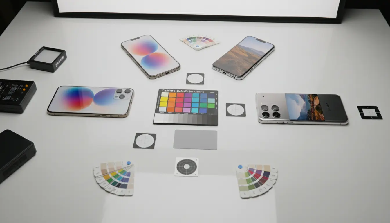
If you want a workflow that feels professional but stays practical, use a reference target.
Use a Gray Card (Or Color Checker for Branding)
A gray card provides a neutral point for white balance correction. A color checker adds multiple patches that help match difficult colors like reds, blues, and skin tone transitions.
Take one reference photo per lighting setup with each device. That’s your anchor for later editing.
Step 4: Post-Processing Workflow for Cross-Device Color Matching
Even with careful shooting, you’ll still need post work for true consistency—especially when you deliver a set as a single story.
Choose One “Hero Device” as the Master Look
Pick the phone that produced the best base image and treat it as your color target. Don’t try to make every photo perfect in isolation. Match everything to the master.
Match in This Order (Fast and Reliable)
- White balance: Fix temperature and tint first.
- Exposure and contrast: Align brightness and black levels.
- Tone curve / highlights: Ensure the same highlight roll-off.
- Saturation and vibrance: Adjust gently; don’t chase intensity.
- HSL tweaks: Correct specific colors (greens and reds are usual trouble).
- Skin tone check: Confirm consistency on faces, not just backgrounds.
This sequence prevents you from “over-correcting” too early.
Use Presets Carefully
Presets can speed up batch consistency, but only if the lighting stays similar. Build a custom preset from your master image, then apply it as a starting point and fine-tune per device.
Step 5: Monitor Calibration and Export Rules (The Hidden Source of Mismatch)
You can do everything right and still end up with weird results if your viewing and exporting are inconsistent.
Edit on a Reliable Screen
At least one device in your workflow should have a trustworthy display mode. If you can, avoid editing on screens with aggressive “vivid” color modes. They can push you to correct colors that weren’t wrong.
Stick to One Color Space
For most mobile sharing and web delivery, exporting in sRGB prevents unexpected shifts across platforms. Consistent color space usage improves the chance that your set looks uniform on Instagram, websites, and client previews.
Keep Compression Consistent
Different export settings can change perceived contrast and saturation. Use the same export size and quality parameters across the whole set.
Step 6: Practical Tips for Real Shoots (Fast Wins)
- Shoot a reference frame at the start and whenever lighting changes.
- Avoid auto filters inside native camera apps when multiple devices are involved.
- Keep the same framing and exposure priority so the scene’s brightness stays comparable.
- Don’t rely on “matching by eye” alone—use a neutral reference and consistent steps.
- Check consistency in a grid view (thumbnail overview reveals mismatch quickly).
Common Multi-Device Scenarios and How to Handle Them
Events and Concerts (Fast Light Changes)
Lock what you can, shoot RAW if possible, and accept that you’ll match in post using a reference frame whenever the lighting changes.
Product Photography for E-commerce
Consistency matters most here. Use a single dominant light, shoot a gray card, and keep reflections controlled. For brand colors, a color checker makes your edits repeatable and defensible.
Social Media Teams (Different Phones, Same Brand Look)
Create a lightweight team guideline:
- One master preset
- A required reference photo per location
- A shared export spec (size + sRGB)
This reduces “editorial chaos” and speeds up approvals.
Recommended Amazon Product (for Better On-Set Matching)
A practical tool that helps significantly with multi-device color matching is a color reference card:
- X-Rite ColorChecker Passport Photo 2