
Monitor Calibration for 120 Nits Work and 160 Nits HDR Preparation (Practical, Repeatable Guide)
If you want consistent color, comfortable brightness, and predictable output across web, photo, and video workflows, calibrating your monitor at 120 nits for daily work is one of the most reliable baselines. At the same time, setting up a second target around 160 nits can help you prepare for HDR-adjacent deliverables (and modern bright UIs) without pushing your display into an overly intense, fatiguing range.
This article explains what these brightness targets mean, when to use each one, and how to calibrate in a way that stays stable over time. You’ll also learn how to verify the calibration, avoid common mistakes, and keep your results consistent across different lighting conditions.
Why 120 Nits Is a Standard for Work
Many creative and office workflows assume a viewing environment that is neither a dark cinema room nor direct sunlight. In these typical indoor conditions, 120 cd/m² (nits) offers an excellent balance:
- You reduce eye strain during long sessions.
- Prints and exports often match expectations better (especially for sRGB-focused work).
- Your perception of midtones stays more consistent across hours of use.
In practice, 120 nits becomes your “reference comfort zone.” It’s especially useful for:
- Photo editing for web and standard print
- UI/UX design targeting normal indoor use
- Writing, coding, spreadsheets, and general productivity
Why 160 Nits Helps with HDR Preparation (and Modern Displays)
True HDR mastering usually targets much higher peak brightness (commonly 600–1000 nits or more) on HDR reference displays. Many typical desktop monitors cannot deliver that kind of HDR performance reliably. However, calibrating a brighter SDR working mode around 160 nits is still useful when you need:
- A bridge between standard SDR work and HDR-related review
- A more “modern device-like” brightness level (phones, laptops, tablets)
- Better visibility in a brighter room, without completely breaking your color judgment
Think of 160 nits as a pragmatic stepping stone: it won’t turn an SDR monitor into an HDR master display, but it can help you prepare assets and grading decisions more responsibly than using random high brightness.
Before You Start: Control the Environment
Good calibration starts with controlling your viewing conditions. If your lighting changes wildly throughout the day, you’ll chase “accuracy” that constantly moves.
Stabilize Room Lighting
- Avoid direct light hitting the screen.
- Use consistent ambient lighting (same lamps, same placement).
- If possible, use a neutral light source (avoid heavily warm or overly cool bulbs).
Warm Up the Monitor
Let the display warm up for 20–30 minutes. Brightness and color stabilize after the panel reaches its normal operating temperature.
Choose the Right Targets (Recommended Settings)
To calibrate for both daily work and HDR preparation, you’ll usually create two monitor presets (or two calibration profiles).
Target Profile A: 120 Nits Work (Baseline Reference)
Use this for most of your day.
Recommended targets:
- Luminance: 120 nits
- White point: D65 (6500K) for general web/video; D50 (5000K) if you strictly soft-proof for print in a D50 viewing booth
- Gamma: 2.2 (common standard); consider 2.4 for dim viewing environments and video-centric workflows
- Color space: sRGB for web/UI; or native + color-managed apps if you know your workflow
Target Profile B: 160 Nits HDR Preparation (Brighter Review Mode)
Use this when checking how work might feel on brighter consumer displays or when your room is brighter.
Recommended targets:
- Luminance: 160 nits
- White point: D65
- Gamma: 2.2 (keep it consistent for comparison)
- Color space: Typically sRGB or wide-gamut with proper color management
Hardware vs Software: What Actually Matters
To get reliable results, you need to separate two steps:
- Monitor adjustment (hardware OSD): brightness, contrast, RGB gains (if available)
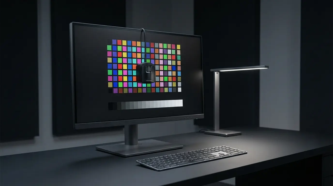
- Calibration and profiling (software + colorimeter): creates an ICC profile to describe and correct behavior
If you only use software sliders without measuring, you’re guessing. If you measure with a colorimeter, you can repeat results and keep them stable over time.
Step-by-Step Calibration Workflow (120 nits then 160 nits)
Below is a practical flow that works with popular tools like DisplayCAL or vendor software (e.g., i1Profiler). The core principles stay the same.
Step 1: Reset and Pick a Neutral Monitor Mode
- Reset monitor picture settings if possible.
- Choose a mode that disables “enhancements”:
- Turn off dynamic contrast
- Turn off local dimming for calibration (unless you have a pro HDR workflow and know exactly what you’re doing)
- Turn off “vivid,” “game,” “super resolution,” etc.
Pick a neutral base:
- “Custom,” “User,” or “Standard” usually works best.
Step 2: Set the Refreshing Basics
- Set your native resolution and a stable refresh rate.
- Disable any OS “night light” or blue-light filters during calibration.
- Ensure the display is set to the intended color mode (sRGB clamp if you primarily deliver to sRGB).
Step 3: Measure and Adjust Brightness to 120 Nits
Using your measurement tool:
- Start measurements.
- Adjust monitor brightness until the measured luminance hits 120 nits.
Keep contrast at default unless the tool instructs you otherwise. Incorrect contrast settings can crush shadows or clip highlights before the profile even gets a chance to help.
Step 4: Adjust White Point (D65) Using RGB Gains (If Available)
If your monitor has RGB gain controls:
- Adjust R/G/B gains until the white point is near 6500K and the RGB balance is even.
If your monitor does not have RGB controls:
- Let calibration software correct the white point via LUT/ICC as much as possible.
Step 5: Calibrate + Create the ICC Profile
Run the full calibration and profiling process. Save the result clearly, e.g.:
MonitorName_120nits_D65_G22.icc
Then set it as the default profile in your OS color management settings.
Step 6: Repeat for 160 Nits (Second Preset/Profile)
Now create a second preset:
- Change only what you must: brightness to 160 nits
- Keep white point and gamma targets consistent
- Run profiling again and save:
MonitorName_160nits_D65_G22.icc
If your monitor supports hardware calibration (internal LUT), store 120 and 160 into separate hardware slots. That’s the cleanest method.
Verification: How You Know You Did It Right
Calibration without verification is incomplete. After profiling, run a validation report.
What to look for:
- Average Delta E should be low (lower is better).
- Grayscale tracking should be smooth.
- No obvious clipping in black/white levels.
Practical real-world checks:
- Open known test images (skin tones, gray ramps, saturated colors).
- Check that shadows hold detail without looking washed out.
- Confirm whites don’t look tinted (too blue/too yellow).
Common Mistakes (and How to Avoid Them)
1) Calibrating Too Bright for the Room
If you calibrate at 160+ nits but work in a dim room, you’ll:
- Misjudge exposure
- Create exports that look too dark on other displays
Use 120 nits as the default, and switch to 160 only when needed.
2) Mixing Color-Managed and Non-Managed Apps
Some apps ignore ICC profiles. This makes your work look inconsistent across software.
Solution:
- Use color-managed applications for critical work (photo/video).
- Keep your OS profile correct.
- Be cautious when judging color in browsers or viewers that don’t manage color properly.
3) Expecting SDR Calibration to Equal HDR Mastering
160 nits is not HDR mastering. It’s a controlled brighter SDR mode to help you anticipate modern viewing conditions.
If you truly deliver HDR:
- You need an HDR-capable display with known performance, correct PQ/HLG handling, and appropriate tooling.
Maintenance: Keep Your Calibration Stable
Accuracy drifts over time.
Best practice:
- Recalibrate every 4–8 weeks for consistent creative work
- Recalibrate sooner if:
- You change room lighting
- You update GPU drivers/OS significantly
- You notice visible shifts in white balance or brightness
Also:
- Keep monitor brightness consistent daily.
- Avoid frequently switching “enhancement” modes.
Building a Simple Two-Mode Workflow (Recommended)
Use these two modes intentionally:
- Mode 1 (120 nits): editing, design, color decisions, long sessions
- Mode 2 (160 nits): quick checks for brighter-device feel, client preview in a bright office, HDR-adjacent review
This keeps your baseline reliable while giving you a controlled alternative when real-world conditions demand it.
Amazon.com Product Recommendation (1 Item)
A widely used, dependable option for monitor calibration is:
- Calibrite ColorChecker Display Pro (formerly X-Rite i1Display Pro) — available on Amazon.com
(Choose the model that matches your OS and needs; it’s commonly used for consistent luminance targets like 120 and 160 nits.)